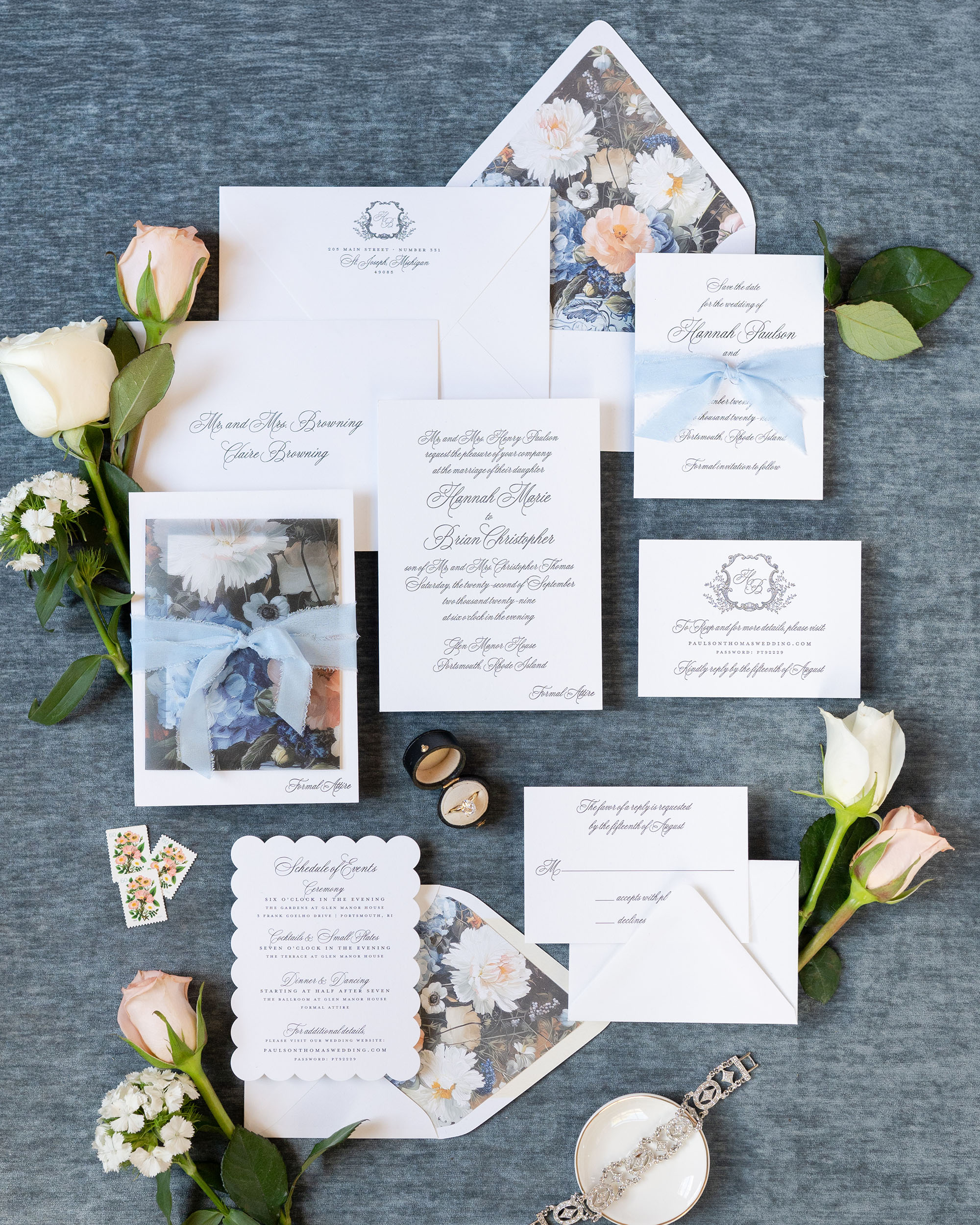
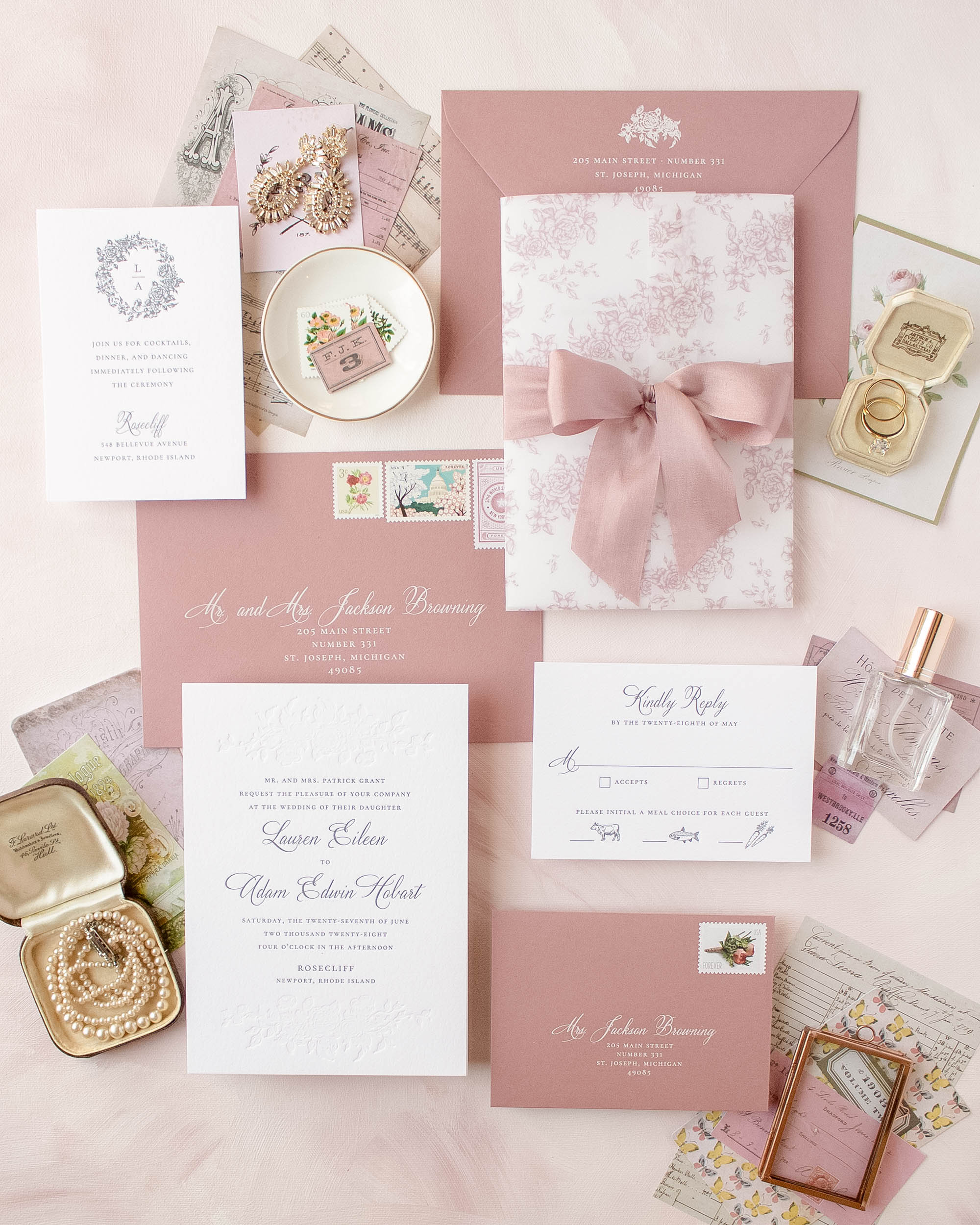
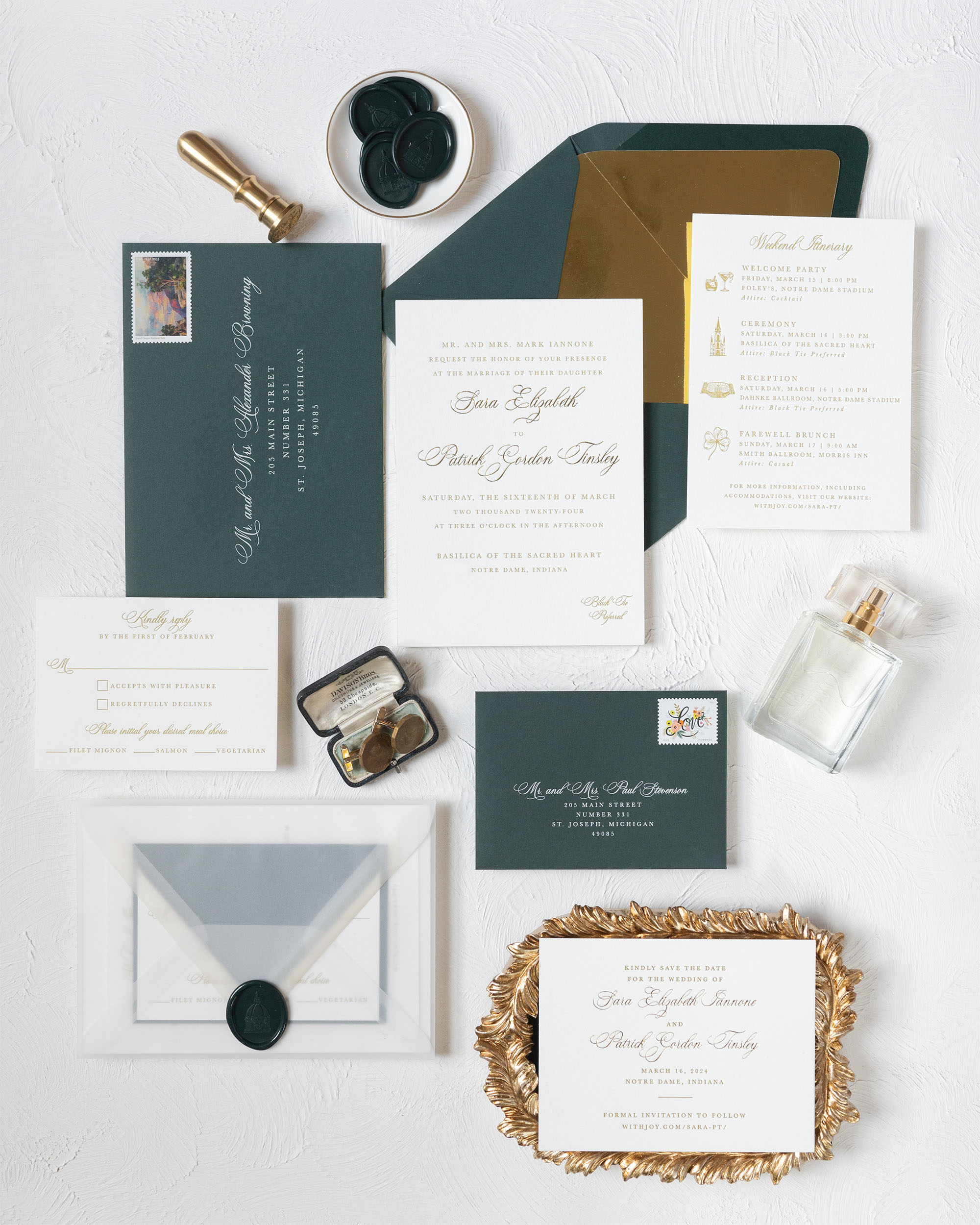
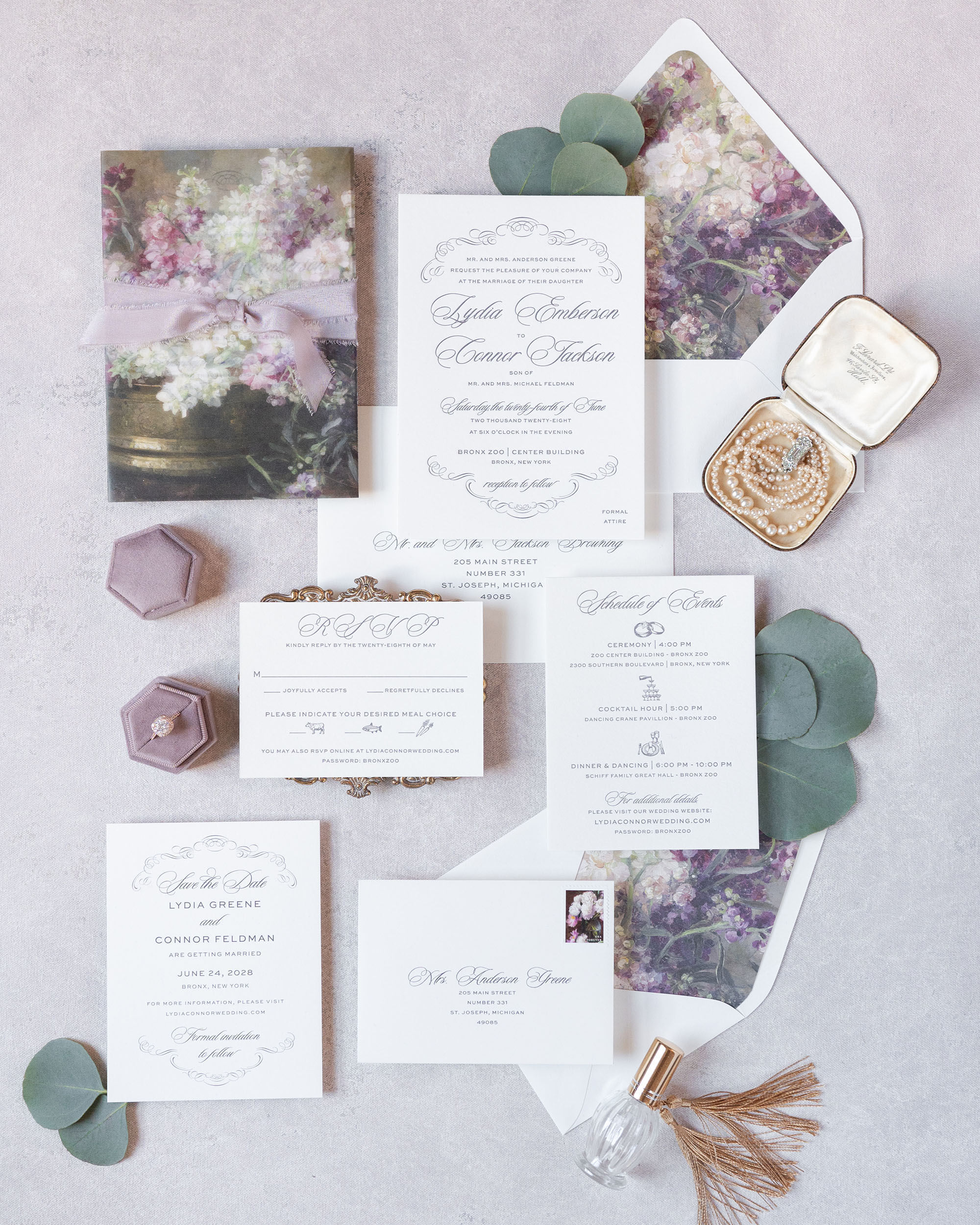
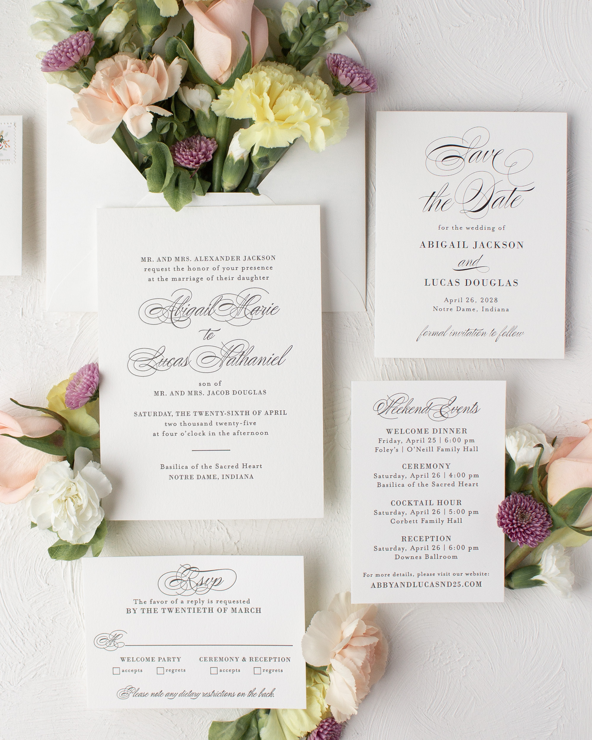
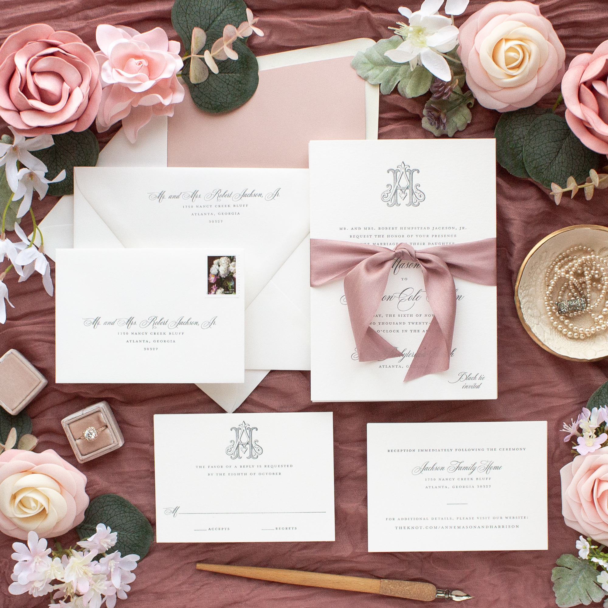
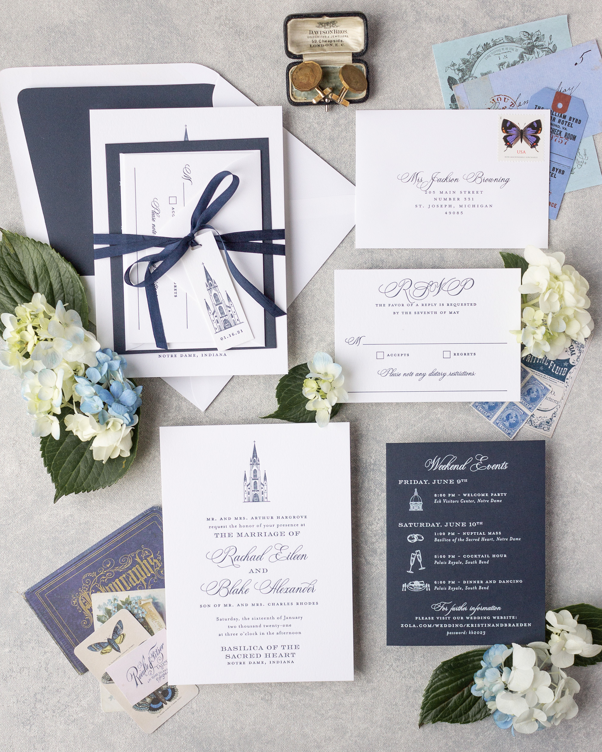
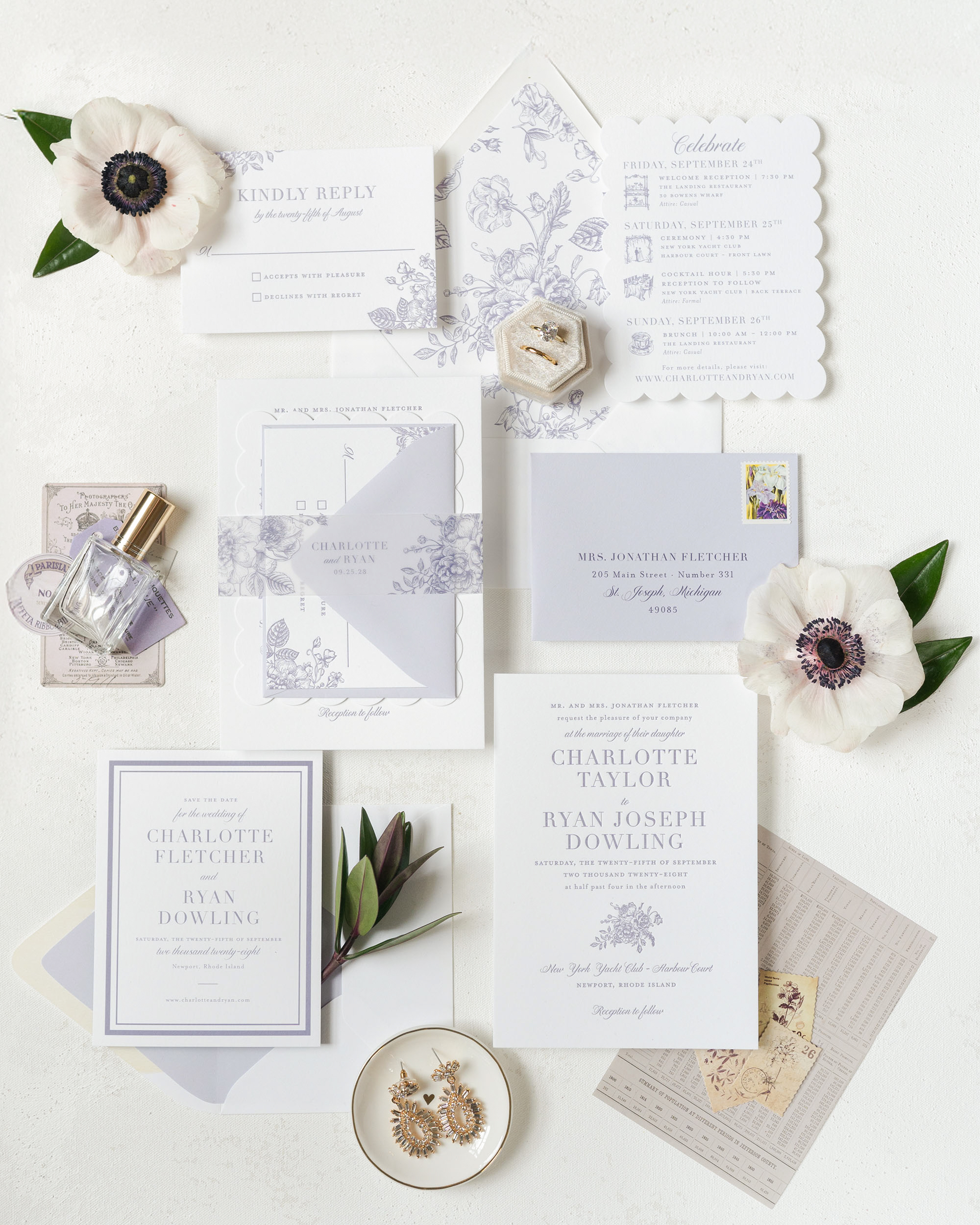
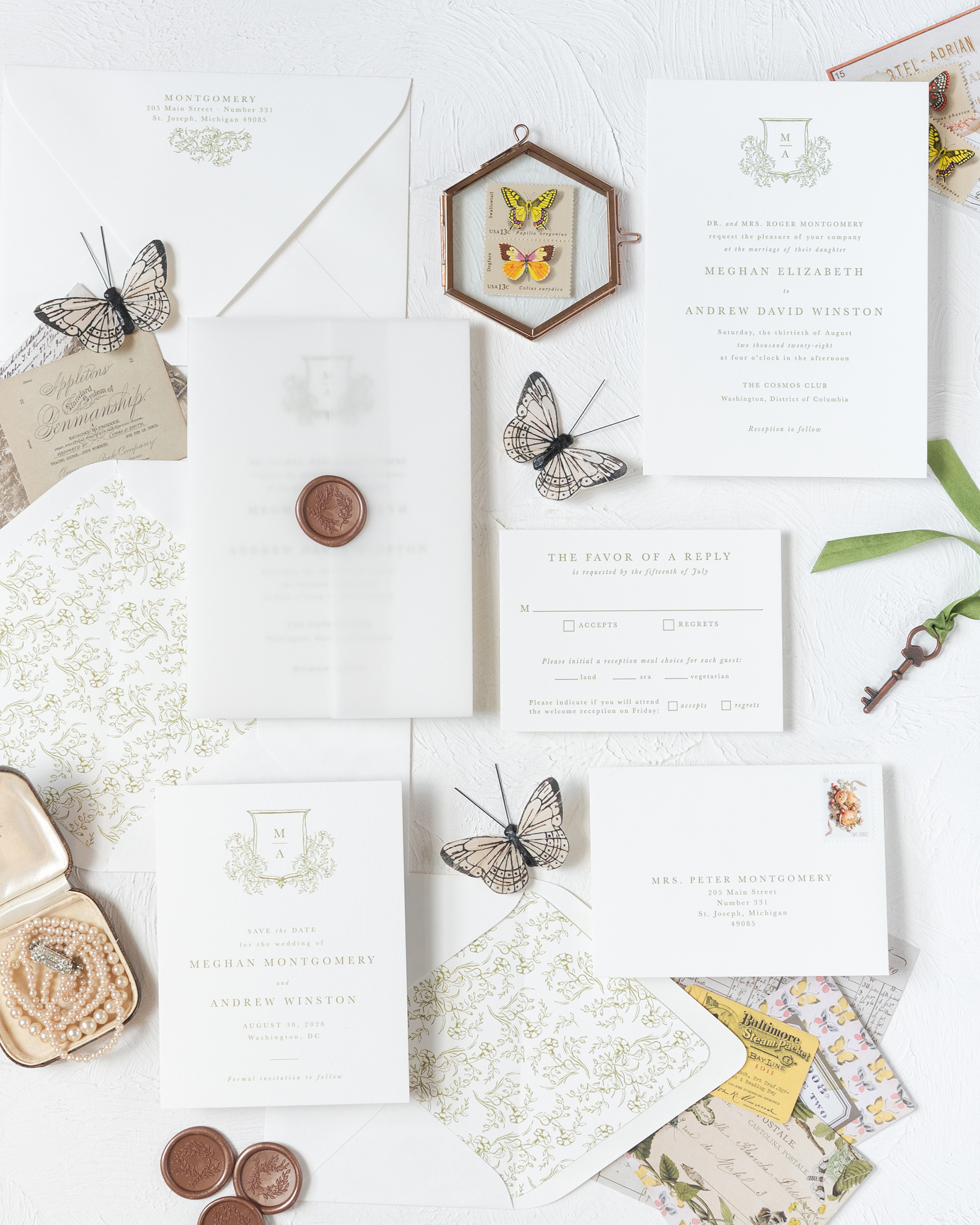
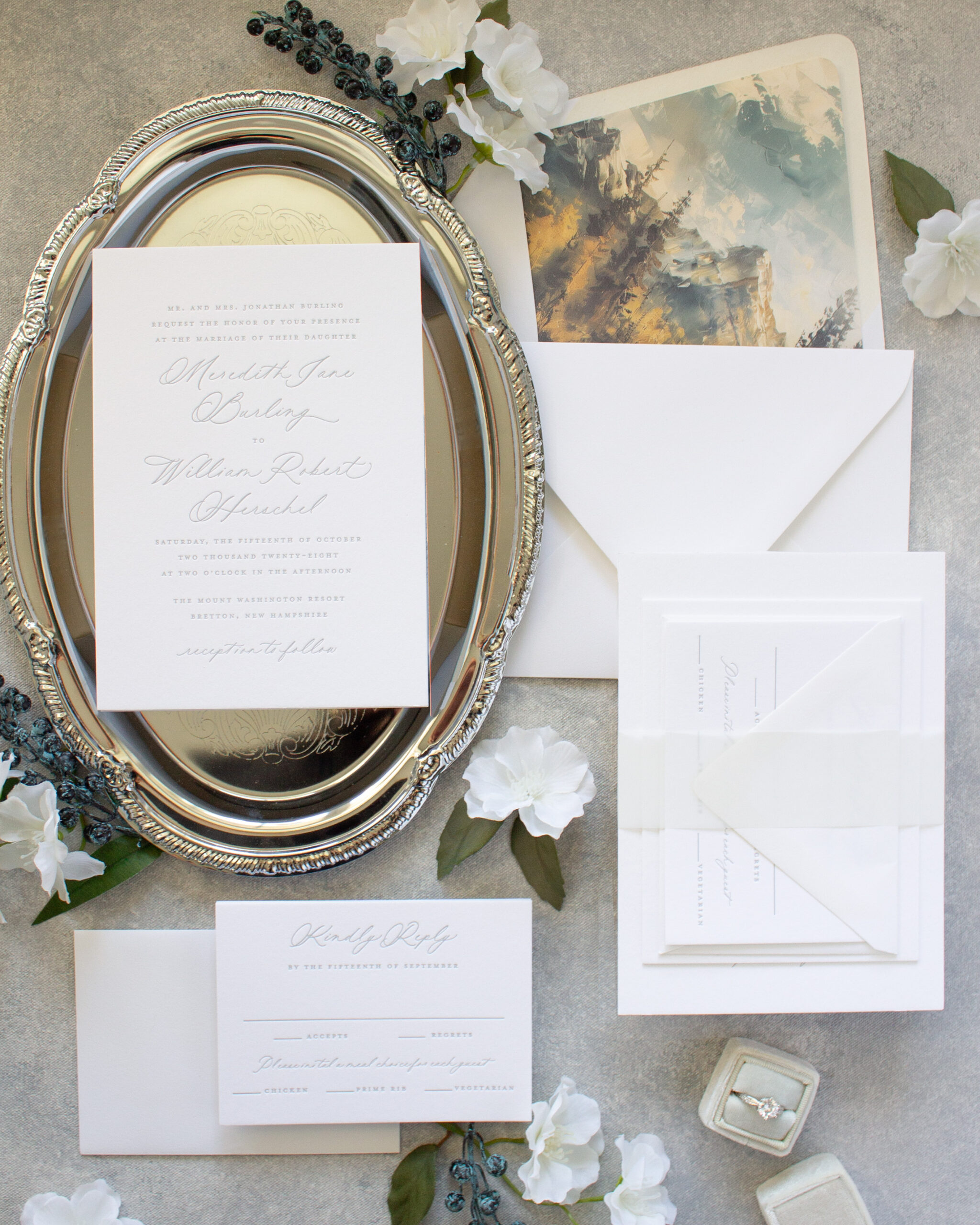
The Harmony letterpress invitation design is simply stunning in blind letterpress and warm gray ink. The neutral colors in this invitation give it a soft, romantic feel without being too “girly”. The blind letterpress portion (also known as blind impress or deboss) is achieved by pressing an uninked printing plate into the paper. It leaves a subtle impression that begs to be touched.
In this version of the Harmony wedding invitation, a single ink color is used for the text and the lace graphic. The colored ink highlights the details in the lace, and as an added bonus, this single color letterpress invitation is a more budget friendly options!
Just when you thought this wedding invitation couldn’t get any lovelier, I added gold foil stamping with navy letterpress and blind impress lace graphics. This stunning letterpress design is formal and elegant with a slightly vintage feel.
I created a custom version of this design for Geraldine (as seen on Oh So Beautiful Paper) in a landscape layout using a combination of copper foil stamping, blind letterpress, and navy blue.
Last but not least, the Harmony wedding invitation design is available in flat printing. Choose any colors you like for the lace and graphic, but this pale pink and gold version is one of my favorite combinations.
Love this design? Learn more about the Harmony wedding invitation or order samples so you can see the gorgeous letterpress stationery in person!