How to Choose the Right Color for your Wedding Invitations | Colors Part I
Choosing the color palette for your wedding invitations is one of the most exciting steps in the design process. Color sets the tone, hints at the style of your celebration, and gives guests a first glimpse of what to expect. But with so many colors to choose from, deciding which ones to use can feel overwhelming!
Your invitations set the stage for your entire wedding day, so it’s natural to incorporate your wedding colors into the stationery suite. Or not! Perhaps you’d like a classic, neutral color palette for your paper goods, or prefer to have a formal black and white invitation and save the splash of color for your wedding day decor.
Banter & Charm offers twenty signature ink colors for flat printing and letterpress. These tried and true ink colors are available in a range of on-trend hues, but if you don’t see the perfect shade we can always custom mix one for you!
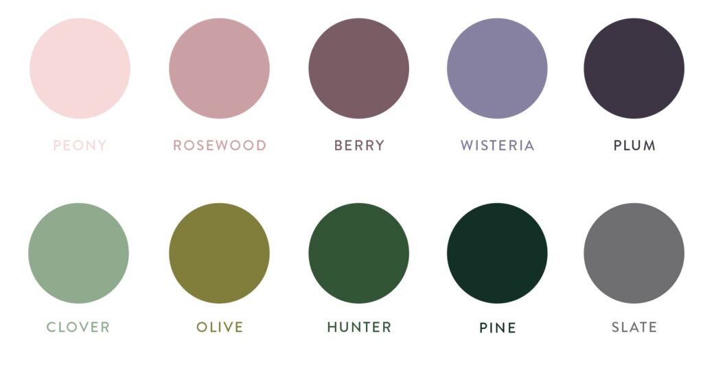
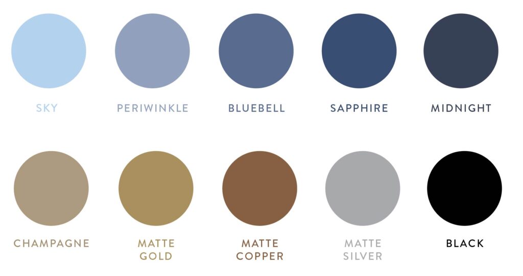
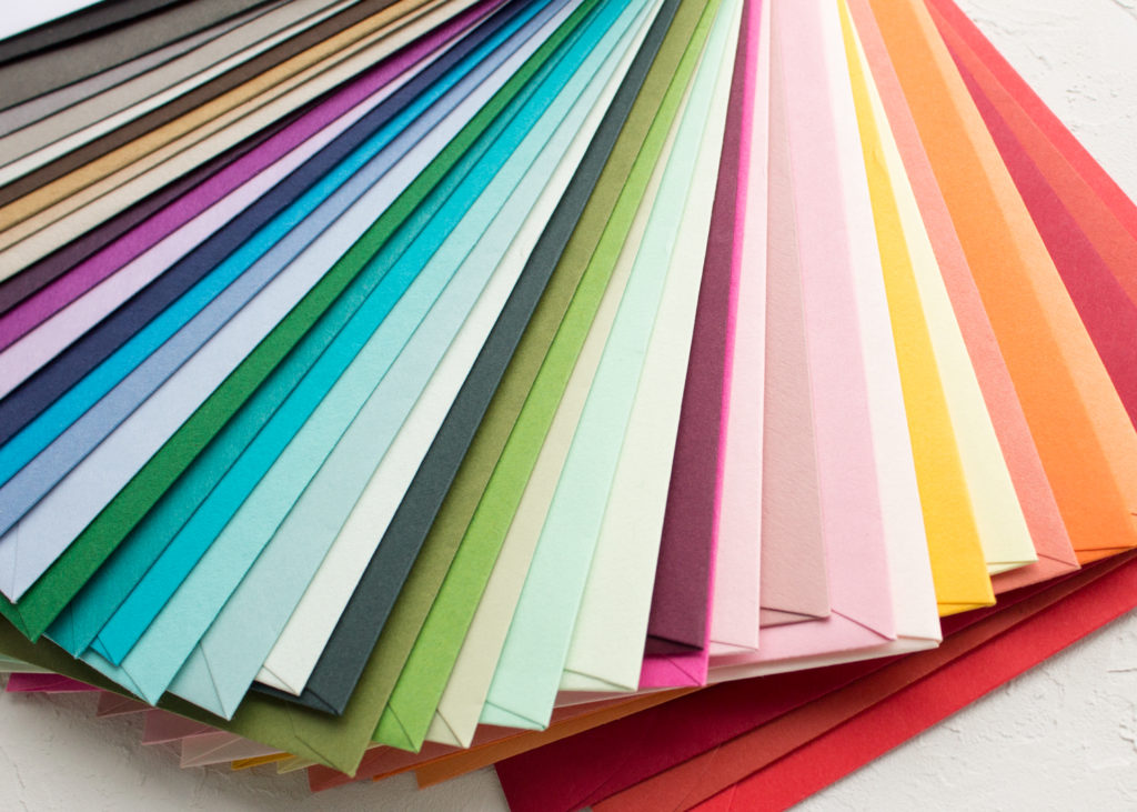
Looking for a colored envelope or paper? They’re available in any of these signature shades as well! If you have your heart set on a shade that isn’t represented here, custom color matching is also available.
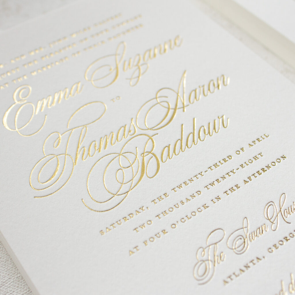
All signature colors are available in lighter shades for flat printing. Metallic gold, silver, and copper inks are offered for letterpress and screen printing. Gold, champagne, rose gold, silver, and copper foil are available for foil stamping.
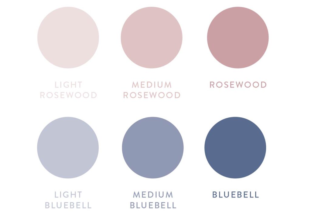
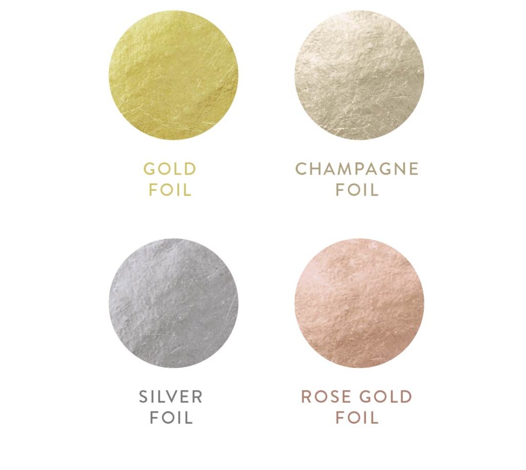
With so many choices, picking the right shade for your invitations can be a daunting task. It’s hard to tell how something will look in person, or if a color will be too light to easily see. That’s why a printed color chart is included in every invitation sample order! You can see each color in person, so there is no guessing whether the color you see on your phone or your fiance’s laptop is closer to the real thing. Spoiler alert: neither one is going to match!
Here’s the thing: all screens are not calibrated to display colors the same. You’ve probably noticed that if you look at a photo on your phone, then later on a computer. Maybe the blue in your shirt is a little more green on one screen, and your pants look much brighter on your tablet, or one has a more yellow cast to it.
The bottom line is: you cannot trust the way colors look on a screen.
Besides the device you’re viewing the colors on, there are a few other factors that can affect the way a color looks.
Printing Method
Different printers and printing methods require different types of ink. Letterpress inks are mixed by hand, so there may be a slight variation between printed pieces.
Think of it this way: printing something on your home inkjet printer won’t yield the same colors that your office laser printer does.
Inks
All letterpress and flat print inks will have a matte (not shiny) appearance when they’re printed on matte cardstock or cotton paper.
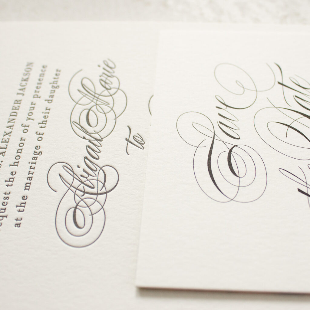
If you want shiny metallic colors, you’ll need to go with foil stamping.
Paper
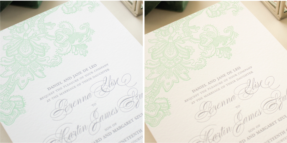
The inks used in flat printing and letterpress are not completely opaque. That means the paper an ink color is printed on also affects the final look. Printing on a soft white paper will give the ink colors a softer, warmer appearance than if you print on a bright white paper.
With so many variables to consider, how can you choose your colors confidently? Order a sample pack to see them in person! Still can’t decide? I’m happy to offer advice on your color choices!
Make sure to read the next post in the “color” series of The Wedding Stationery Guide, where I share details on some “color” choices that aren’t really colors at all: white ink and blind letterpress!
