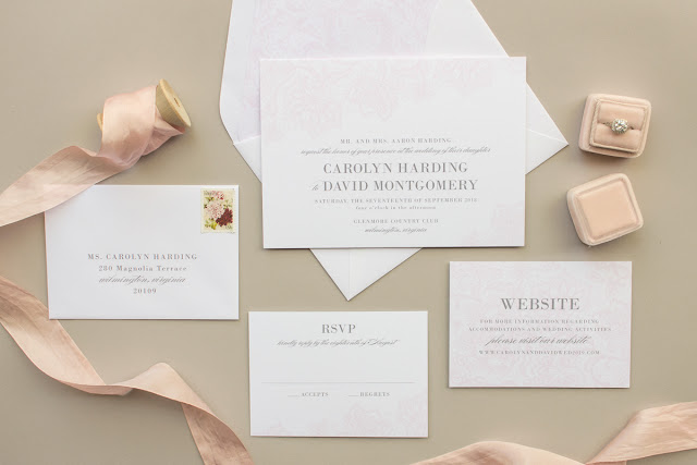
Now that we’ve reviewed the printing methods offered and learned a bit about invitation paper, it’s time to talk about ink colors!
When you first started your wedding planning, you likely thought about your colors. What color dresses the bridesmaids would wear, what color flowers you’d carry, or what color table cloths you’d use at your reception. Since your invitation is the first look your guests will have at your wedding style, it’s natural to incorporate your wedding colors into the invitation suite. (Or not! That’s totally fine too!)
Much like the color options available for your dresses or table cloths, Banter & Charm also has a set palette of ink colors available for wedding invitations. We’ve carefully selected a range of 62 standard ink colors for flat printing and letterpress. You can also choose metallic silver or metallic gold ink for letterpress orders, or pick from gold, silver, or rose gold foil for foil stamp orders.
Picking the right shade for your invitations can be a daunting task. It’s hard to tell how something will look in person, or if a color will be too light to easily see. That’s why we include a printed color chart with every invitation sample order! You can see each color in person, so there is no guessing whether the color you see on your phone or your fiance’s laptop is closer to the real thing. Spoiler alert: neither one is going to match!
Here’s the thing: all screens are not calibrated to display colors the same. You’ve probably noticed that if you look at a photo on your phone, then later on a computer. Maybe the blue in your shirt is a little more green on one screen, or your pants looks much brighter on your tablet.
The bottom line is you cannot trust the way colors look on a screen.
Besides the device you’re viewing the colors on, there are a few other factors that can affect the way a color looks.
Printing Method Different printers and printing methods require different types of ink. Letterpress inks are mixed by hand, so there may be a slight variation between printed pieces.
Paper The inks used in flat printing and letterpress printing are not completely opaque. That means the paper an ink color is printed on also effects the final look. Printing on a soft white paper will give the ink colors a softer, warmer appearance than if you print on a bright white paper.
Inks Flat print and letterpress inks on cotton paper will have a matte appearance (even the metallic shades- if you want shiny, you’ll need to go with foil stamping).
ACCURATELY PROOFING YOUR INVITATION COLORS
Since computer and phone monitors don’t display colors accurately, how can you preview your invitation colors? If you’ve ordered a sample pack, it includes a printed chart of Banter & Charm’s ink color options.
You can also request a printed proof of your order (prior to final approval). Printed proofs for flat printed stationery are available for $10 per piece + shipping. Printed proofs are not available in letterpress or foil stamping.
Next week I’ll be sharing some tips for choosing your colors, along with information on non-colors like white ink and blind letterpress.
You can find all the posts in this series here: The Wedding Stationery Guide
© Banter & Charm | All Rights Reserved


