How a Font Change Can Transform a Design | Wedding Stationery Guide: Fonts, Part II
Sometimes you fall in love with an invitation design, but wish that the font was a little different. Maybe you have a fancier script in mind, or a mid-century sans-serif to compliment your art deco theme. No matter what you’re looking for, font change is included with every wedding invitation order at Banter & Charm! But sometimes simply changing the font can have a big impact on the overall design!

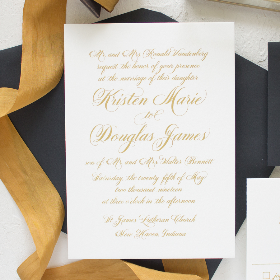
I’m going to use the Sweetheart suite in my first example. This design uses only one font – an elegant, hand calligraphy inspired script with loopy flourishes that give it a feminine and traditional feel.

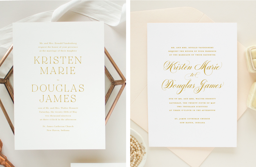
Since this is such a simple design, changing the font can completely transform the design. In the version on the left, the font has been changed to a script that still has lots of loopy flourishes, but it’s more casual and gives the invitation a less formal feel. The version on the right features another hand calligraphy inspired script font, but where the original design was traditional and formal, this one is more modern and organic.

Script fonts have a great personality, but what if you don’t want a script font? There are plenty of alternatives, like the unique display typeface used in the invitation design on the left. Still formal like the original design, but now it has more of a masculine feel.
Don’t feel like you need to change all of the text to the same font! (I’ll share more tips about combining fonts in another post) Maybe all the script text is overwhelming, or you’re concerned about legibility. No problem! Leave the bride and groom’s names in the original calligraphy script, and use an easy to read serif font for the rest of the invitation wording.

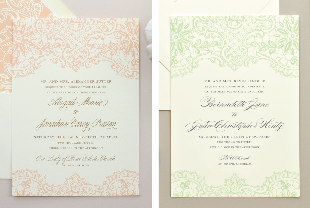
As you can see, changing a font can completely transform the look and feel of an invitation design. But maybe you like the formal style of an invitation, but the script font it’s featured with just isn’t your favorite. Choosing another font in a similar style can fix that! Below are four versions of the Hope wedding invitation, using different script fonts for the names and venue, but the font for the main text stays the same. Each version is subtly different than the other, but they all have the same sweet, romantic feel.


Hopefully, these examples will help you see how changing the font can impact the overall look and feel of the design. You can pick the font for your wedding invitation design, so feel free to browse the Font Guide and find your favorite!
You can find all the posts in this series here: The Wedding Stationery Guide