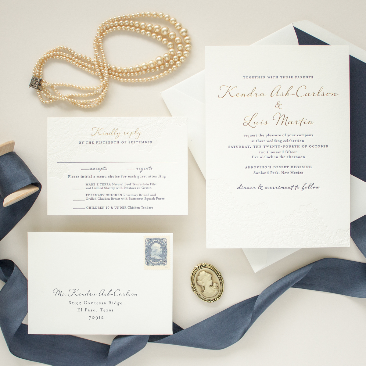
Navy and Gold Foil Invitations | Harmony Foil These navy and gold wedding invitations feature the bride and groom’s names in gold foil with navy accents. A delicate blind letterpress printed lace-inspired design adds a romantic touch to this romantic invitation suite. See this design in letterpress or copper foil stamping
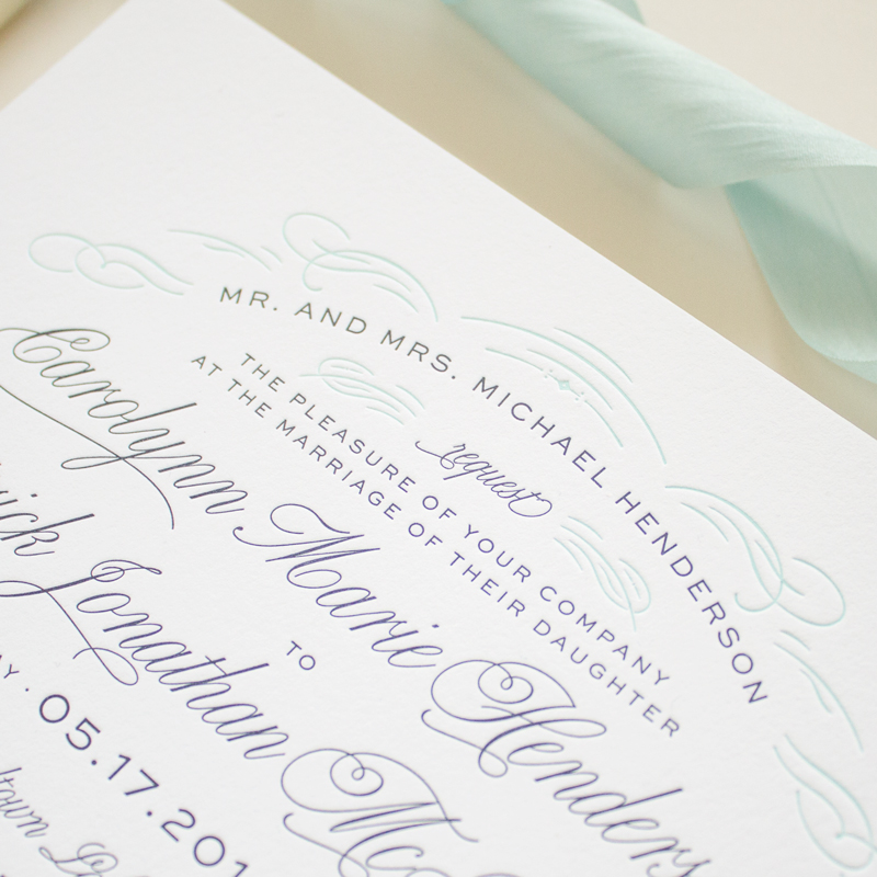
Classic Invitation Design in Letterpress | Sophsticate This classic invitation design in letterpress printing features edge painting on double thick cotton paper for a truly luxurious look. It’s an elegant invitation suite is perfect for a formal wedding or black tie event.
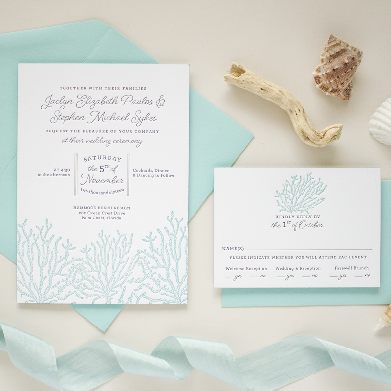
Beach Themed Wedding Invitations | Coral Reef These beach themed wedding invitations in letterpress printing feature a coral reef graphic in pale blue and double thick cotton paper with edge painting. Perfect for a destination wedding at the beach or a tropical venue!
When browsing invitation designs, you will probably notice that most are available in a standard 5″x7″ size (also know as “A7” size). Although other sizes are certainly available, Banter & Charm follows tradition and offers all invitations and save the dates in the standard A7 size. Why? Well, there are a few reasons but the main […]
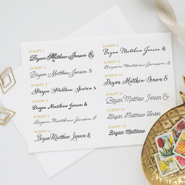
In this third installment of the Fonts portion of the wedding stationery guide, I’m going to share some tips for choosing the fonts for your wedding invitation. When I designed the wedding invitation collection for Banter & Charm, I spent a great deal of time finding the perfect font to match the style of each […]
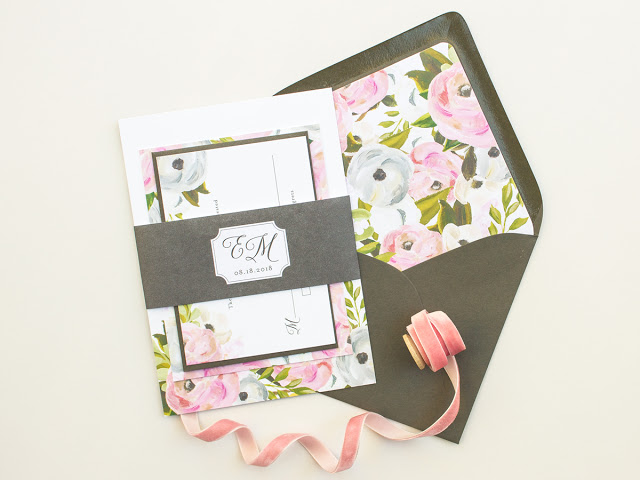
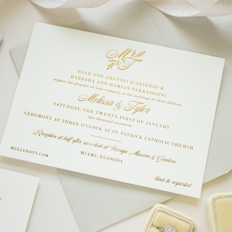
Gold Foil Monogram with Leaves | Darling This gold foil wedding invitation features an elegant monogram embellished with leaves. The gold foil monogram on the invitation will be customized with your initials. Other monogram styles are also available.
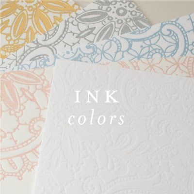
In the first part of the Ink Colors portion of the Wedding Stationery Guide, I shared some ink color basics along with tips on how to accurately preview your colors. Part II of the ink colors series included helpful suggestions and considerations for choosing your colors. Today I’m going to talk about some very special “non […]
In the first part of this Ink Colors series of the Wedding Stationery Guide, I went over a few things that impact the way an ink color looks, and how to accurately preview your colors. Today I’ll share some tips on choosing your colors. CHOOSING YOUR COLORS There are a few things to keep […]
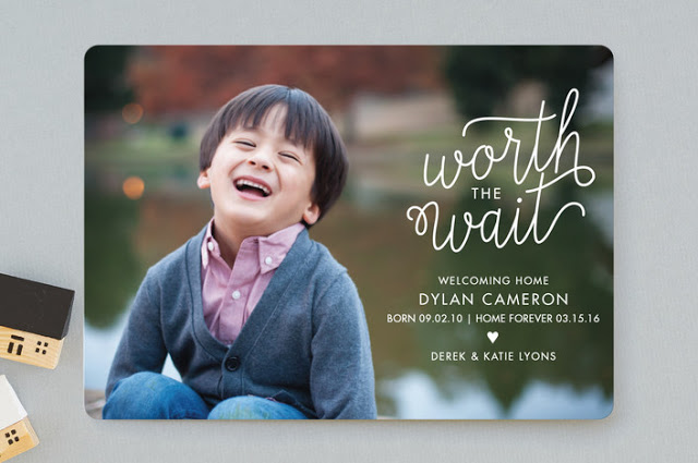
Worth Waiting For is a modern full bleed birth announcement for Minted. The featured design is shown as an adoption announcement, but the text “Worth the Wait” would also make it a great pregnancy announcement for a couple that has faced infertility, or a standard birth announcement as an acknowledgement of the long wait from […]
Now that we’ve reviewed the printing methods offered and learned a bit about invitation paper, it’s time to talk about ink colors! When you first started your wedding planning, you likely thought about your colors. What color dresses the bridesmaids would wear, what color flowers you’d carry, or what color table cloths you’d use at […]
