Wedding Stationery Guide: Ink Colors, Part II
In the first part of this Ink Colors series of the Wedding Stationery Guide, I went over a few things that impact the way an ink color looks, and how to accurately preview your colors. Today I’ll share some tips on choosing your colors.
CHOOSING YOUR COLORS
There are a few things to keep in mind when you choose your invitation colors. You’ll want to consider the design you’re ordering, the printing method, the color of any accessories you’ll add, and the paper you’re printing on. Also think about the legibility of the color (I don’t recommend using light colors for small text).
If you’re having a very formal wedding, you may want to stick to darker, more traditional colors (think black, navy, or gray). But a modern wedding invitation might look better in bold, bright colors like fuchsia or peacock. If you’re going for a vintage feel, try lighter neutral shades like taupe, pale pink, or mint. Shades of blue often work well for beach weddings, and rich greens can be a perfect compliment to your outdoor ceremony.
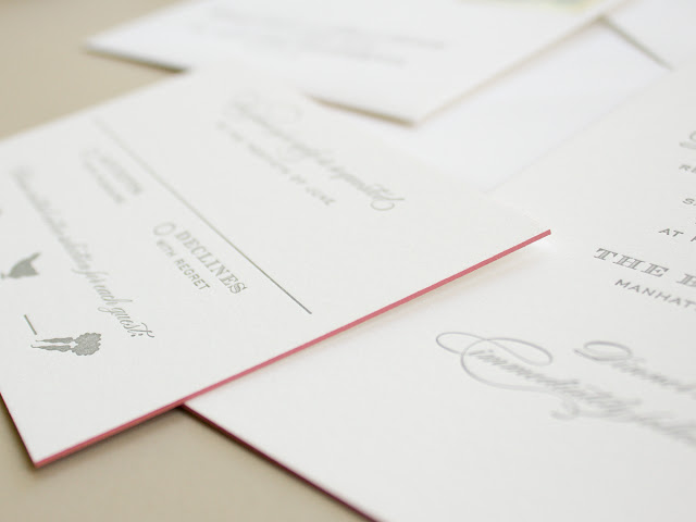
Number of Colors How many colors would you like to incorporate? Do you have a main color and an accent color? Or are you using a rainbow of shades in your wedding color palette? Keep in mind that there are lots of ways to bring color into your invitation suite beyond ink colors: think colored envelopes, envelope liners, colored papers, edge painting, or belly bands. You can also use different colors on each piece in your order if you like.
Printing Method While you’re welcome to print a flood of color with flat printing, letterpress works best with smaller sections of colors. Also keep in mind that flat print orders include unlimited ink colors, but letterpress and foil stamp orders are priced per ink or foil color.
Design Will your chosen design work with the colors you selected?
This is where I’m happy to step in! If you have any concerns about using different colors in a design I’d love to hear your ideas and share advice.
However, I do want to mention: colors are subjective. What I think is the perfect shade of blush pink might look salmon to you. So while I’m happy to give suggestions, you really need to go with your gut and pick the color that speaks to you.
Check back soon for the third part of the ink colors guide where I’ll share information about some very special “non colors”: white and blind letterpress!
You can find all the posts in this series here: The Wedding Stationery Guide
© Banter & Charm | All Rights Reserved

