• Home
  • About
  • Blog
  • Nav Social Menu

    • Email
    • Facebook
    • Instagram
    • Pinterest

Banter and Charm

  • About
  • Collections
    • View All Invitations
    • Browse by style
      • Classic
      • Monogram
      • Calligraphy
      • Formal
      • Typography
      • Venue Sketch
      • Borders
    • Letterpress
    • Foil Stamp
    • Bespoke
    • Save the Date Cards
  • Services
  • Blog
  • Contact
    • Contact
    • Request a Quote

Tips for Choosing Your Invitation Colors | The Wedding Stationery Guide: Colors Part II

Wedding Stationery Guide

3 Jul

Incorporating a bride’s color palette into her wedding invitations has become one of my favorite puzzles to solve! There are so many ways to combine colors through the various pieces in an invitation suite, and something as simple as using a colored envelope for the RSVP card can have a huge impact on the overall look.

tips for choosing your invitation colors

Besides incorporating the different shades of your wedding color palette, there are a few key things to keep in mind when you choose your invitation colors.
You’ll want to consider the design you’re ordering, the printing method, the color of any accessories you’ll add, and the paper you’re printing on. Also, think about the legibility and visibility of the color (I don’t recommend using light colors for small text, but a soft colored flower illustration can be a gorgeous accent).

lace wrap wedding invitations

Number of Colors

How many colors would you like to incorporate? Do you have a main color and an accent color? Are you using a rainbow of shades in your wedding color palette, or do you prefer a monochrome look?

If you’re having a very formal wedding, you may want to stick to darker, more traditional colors (think black, navy, or gray). But a modern wedding invitation might look better in bold, bright colors like fuchsia or peacock. If you’re going for a vintage feel, try lighter neutral hues like taupe, pale pink, or mint. Shades of blue often work well for beach weddings, and rich greens can be a perfect compliment to your outdoor ceremony.

The number of colors you choose will also impact your total cost. Letterpress and foil stamp pricing is based on the number of colors you use (because a separate printing plate and run through the printing press is required for each color).
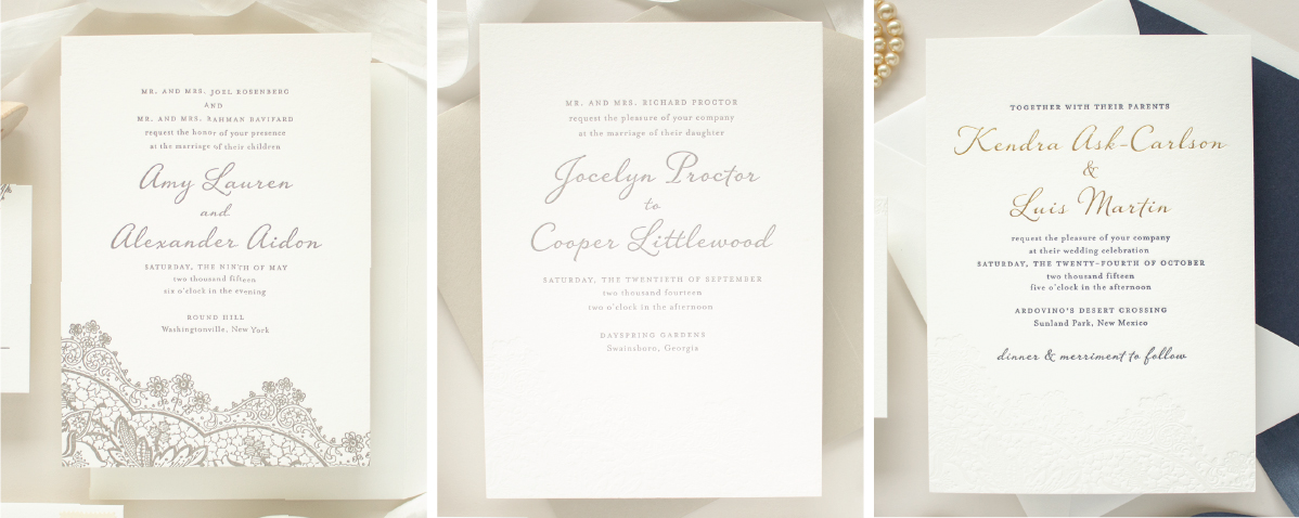
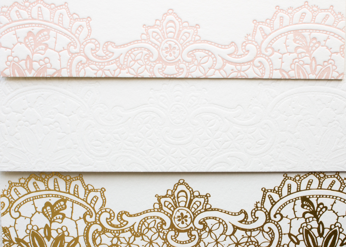
The examples of the Harmony invitation below show the same design, but with a different number of ink colors. Left is one ink color (steel), center is two colors (blind + steel), and right is three colors (navy, blind, and gold foil)
using different numbers of inks

Paper & Accessories

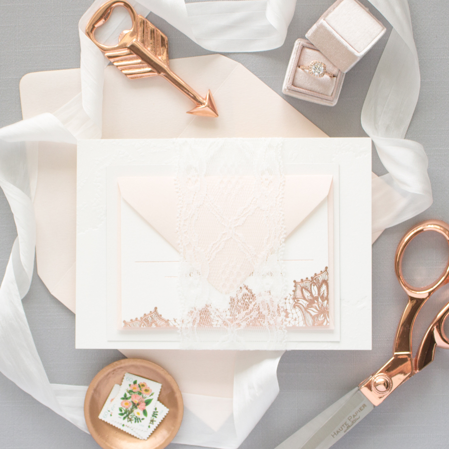
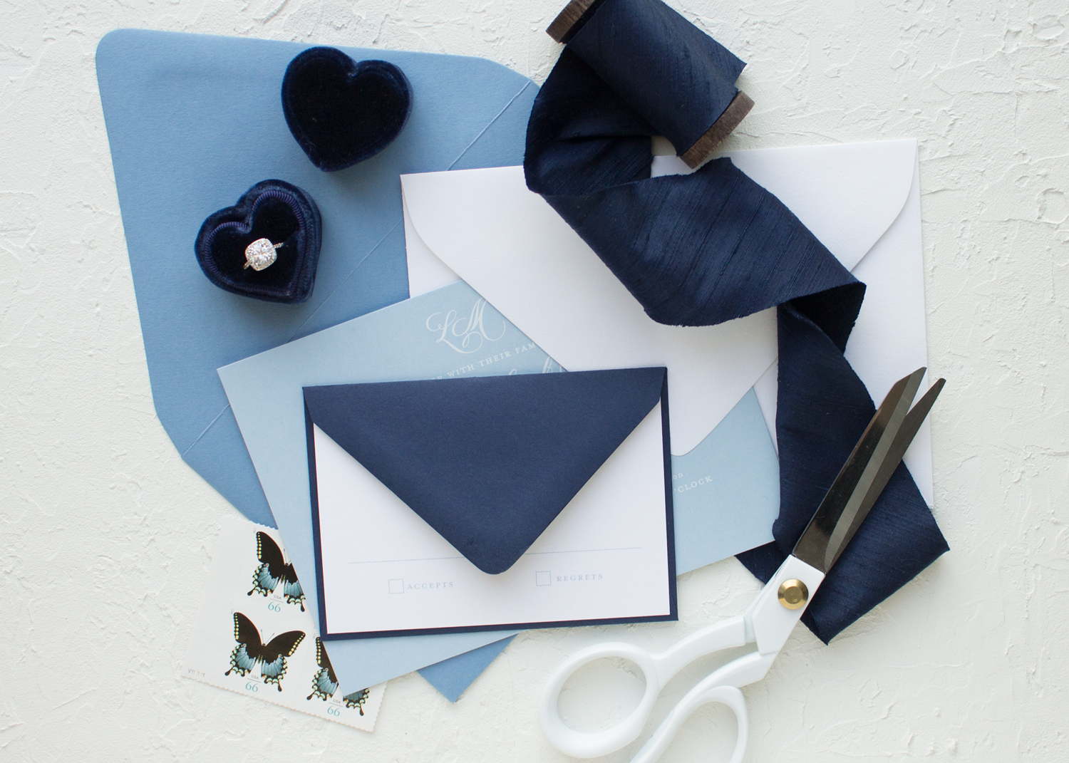
Keep in mind that there are lots of ways to bring color into your invitation suite beyond ink colors: think colored envelopes, envelope liners, colored papers, edge painting, or belly bands. You can also use different colors on each piece in your order if you like.
ombre blue wedding envelopes

Design

Will the colors you picked work with the design you’re dreaming of? This is where I’m happy to step in! It can be so hard to picture an invitation in different colors, so I’m happy to provide proofs in a variety of color combinations. During the design process, we’ll continue to adjust colors until everything looks exactly the way you want.

As you can see from the examples below, the Hope design is versatile and works well in many different colors!
invitation in different colors

Printing Method

While you’re welcome to print a flood of color with flat printing, letterpress works best with smaller sections of colors. Also, keep in mind that flat print orders include unlimited ink colors, but letterpress, screen print, and foil stamp orders are priced per ink or foil color.
blind letterpress comparison
Looking for more tips on using colors in your wedding stationery suite? Read Part I and Part II of this series from The Wedding Stationery Guide!

Previous Post: « Blind Letterpress and White Ink Printing | The Wedding Stationery Guide: Colors Part II
Next Post: Using Metallic Gold in your Invitation Suite | The Wedding Stationery Guide: Colors Part IV »

Primary Sidebar

MEET SARAH

Hello! I´m Sarah - I am a mom, wife, and stationery designer living in southwest Michigan. I believe in God and good manners, love beautiful typography, adore traditions, and am infatuated with pretty paper.
Read More…

Categories

Let’s Connect

  • Email
  • Facebook
  • Instagram
  • Pinterest
  • Twitter

Shop now: Minted.com

Looking for something?

  • Home
  • About
  • Shop
  • Policies
  • Contact

Footer

ABOUT ME

I’m Sarah, and I create tailor-made wedding stationery for brides that need a simple, classic invitation design with just the right amount of personality.

Banter & Charm is a Michigan wedding invitation design studio based in St. Joseph. Not local? I serve brides throughout Michigan and northern Indiana, Notre Dame, Chicago, the Midwest, and across the US. Read More…

Make sure your invitations are

EMILY POST-APPROVED

Avoid common etiquette mistakes with this free guide.

CONTACT

Feel free to contact me anytime:

 hello@banterandcharm.com

 Schedule a phone consultation

BANTER & CHARM

205 Main Street #331
St. Joseph, Michigan 49085
–
by appointment only

banterandcharm

How do you make a venue illustration even better? How do you make a venue illustration even better? Add gold foil! ⁠
This custom illustration of the Basilica of the Sacred Heart at Notre Dame is gorgeous on its own, but adding gold foil took it up another level . When you're getting married in such a meaningful venue, why not highlight that on your invitations?⁣⁠
Not getting married at the Basilica? I'd be happy to draw a custom illustration of your wedding venue!! Get in touch to find out more.⁣⁠
⁣⁠
.⁣⁠
.⁣⁠
.⁣⁠
.⁣⁠
.⁣⁠
#basilicabride #notredamewedding #venue_ND #chicagowedding #midwestbride #notredamebasilica #notredame #letterpressinvitations #customstationery #custominvitation #iloveletterpress #navywedding #basilicaofthesacredheart #custominvitationdesigner #weddinginspo⁣⁠ #foilstamping⁠
How elegant is this letterpress invitation suite f How elegant is this letterpress invitation suite for Margaux and Michael's wedding 😍⁠
⁠
.⁠
.⁠
.⁠
.⁠
.⁠
#customweddingstationery #michiganinvitationdesigner #chicagobride #weddinginvitations #weddinginspo #weddinginvites #customstationery #banterandcharm #fineartweddings  #iloveweddingdetails #monogrameverything⁠
#weddinginvitationdesigner⁠ #monogram⁠
Loving the shades of blue in this pretty invitatio Loving the shades of blue in this pretty invitation suite! The combination of dusty blue and pastel blue is so pretty, and how perfect is the wax seal holding everything together?⁠
.⁠
.⁠
.⁠
.⁠
.⁠
#banterandcharm #dustybluewedding #customweddinginvitations #waxseal #waxsealinvitations #frenchbluewedding #fineartwedding #michiganweddings #lovemidwestbride #weddingdetails
Looking for ways to streamline your wedding statio Looking for ways to streamline your wedding stationery planning? I have just the thing! I've put together my top 5 tips for stress-free wedding stationery - link in profile.⁠
⁠
.⁠
.⁠
.⁠
.⁠
.⁠
#weddingplanningtips #notredamewedding #weddingstationery #weddinginvitations #weddinginvitations #custominvitations #midwestbride #chicagobride #customstationery  #dailydoseofpaper #persuepretty #michiganwedding ⁠
#weddingplanning #weddingdetails #weddingideas #stationery #weddingdesign
I can't think of a better way to make your wedding I can't think of a better way to make your wedding invitations stand out in the mail than with hand calligraphy 😍 A gorgeous burgundy colored envelope helps too ☺️⁠
How often is it that you received a piece of mail with your name handwritten on it? And when the calligraphy is as gorgeous as this work by @madebymeer , the envelope becomes a personalized piece of art!⁠
⁠
.⁠
.⁠
.⁠
.⁠
.⁠
#sendmoresnailmail #snailmailrevolution #calligraphy #weddinginvitations #custominvitations #michiganweddinginvitations #weddingcalligraphy #shesaidyes #weddindetails #fineartwedding #dailydoesofpaper #weddinginspo
Are you team photo or no photo for the save the da Are you team photo or no photo for the save the date card? Either way, I've got you covered! Whether you want to show off your sweet engagement photos or you prefer a formal announcement Banter & Charm has plenty of styles to choose from. Not sure which you want? I'm happy to help out!⁠
.⁠
.⁠
.⁠
.⁠
.⁠
#fineartwedding #dailydoseofpaper #customweddinginvitations #customdavethedatecards ⁠
#stationeryaddict #bridetobe #engagementring⁠
#luxurywedding #loveauthentic⁠
#weddinginvitations #banterandcharm
Tiny details like this make my heart happy ♥️⁠
.⁣⁠
.⁣⁠
.⁣⁠
.⁣⁠
.⁣⁠
#letterpressinvitations #custominvitations #stationerydesginer #blacktiewedding #blacktiepreferred #banterandcharm #monogrameverything #navyweddinginvitations #georgiabride #southernweddings #dailydoseofpaper #invitationdetails #letterpresslove #classicinvitations #blacktie
Today in #theweddingstationeryguide, I'm going bac Today in #theweddingstationeryguide, I'm going back to basics with a rundown of the different pieces in an invitation suite, along with some helpful tips for each item. Blog link in profile!⁠
⁠
.⁠
.⁠
.⁠
.⁠
.⁠
#weddingwednesday #banterandcharm #weddingetiquette #stationerydesigner #weddingplanningtips #weddinginvitationdesigner #weddingpaper #weddingplanningadvice #invitationdetails #dailydoseofpaper #michiganinvitationdesigner #chicagobride #mibride #southernbride #southernwedding
Load More... Follow on Instagram

Copyright © 2022 · BANTER & CHARM · all rights reserved