• Home
  • About
  • Blog
  • Nav Social Menu

    • Email
    • Facebook
    • Instagram
    • Pinterest

Banter and Charm

  • About
  • Collections
    • View All Invitations
    • Browse by style
      • Classic
      • Monogram
      • Calligraphy
      • Formal
      • Typography
      • Venue Sketch
      • Borders
    • Letterpress
    • Foil Stamp
    • Bespoke
    • Save the Date Cards
  • Services
  • Blog
  • Contact
    • Contact
    • Request a Quote

Blind Letterpress and White Ink Printing | The Wedding Stationery Guide: Colors Part II

Printing Primer· Wedding Stationery Guide

27 Jun

When you’re choosing colors for your wedding invitation suite, you might stop when you get to “Blind” and “White” as color options. Blind doesn’t sound like a very pretty color, and how would you even see white ink? Sound confusing? Don’t worry, I’m going to clear up the mystery about printing with these two “colors” that aren’t really colors at all.
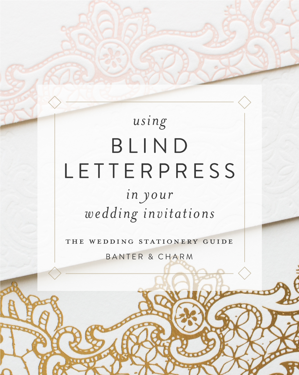
using blind letterpress in your invitations

Blind Letterpress

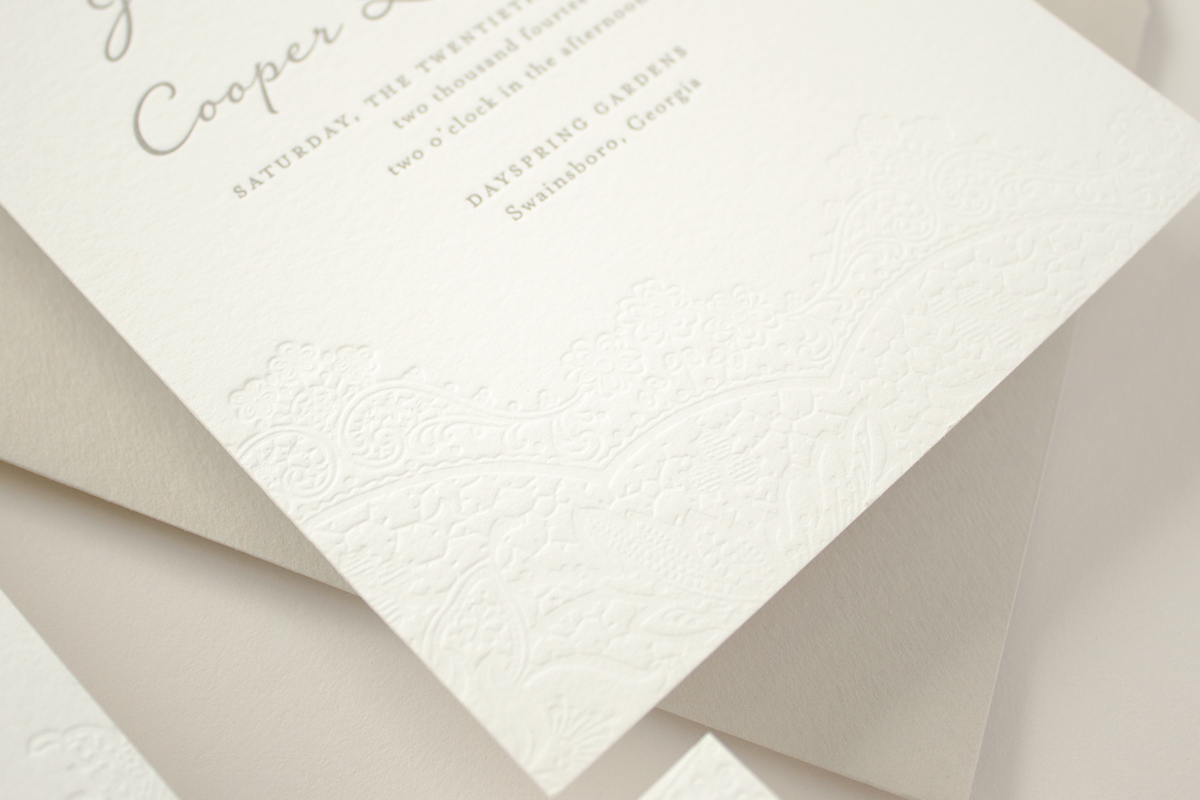
One of the all-time most popular designs in Banter & Charm’s wedding collection is the Harmony invitation suite. This romantic and elegant design features a lace-like pattern pressed into the paper that is stunning, but also a huge source of confusion for many brides. What are the indentations in the paper? Can we change the texture design on the paper? How do you get that pattern pressed in the paper?

Well, those “indentations” in the paper are called blind letterpress (also referred to as blind impress, blind deboss, embossing, or debossing) is the technique of letterpress printing with an un-inked plate to press a design into the paper. The result is a subtle texture without color.

blind letterpress wedding invitations

Blind letterpress still involves creating a custom printing plate and running the paper through the printing press a separate time to press the indentations into the paper. Although no ink is used, the press time and labor involved is the same as printing with an ink color. So while it’s not technically a “color”, blind letterpress is considered a “color” when it comes to pricing. Letterpress printing is priced per color since each color requires a separate printing plate and run through the press.

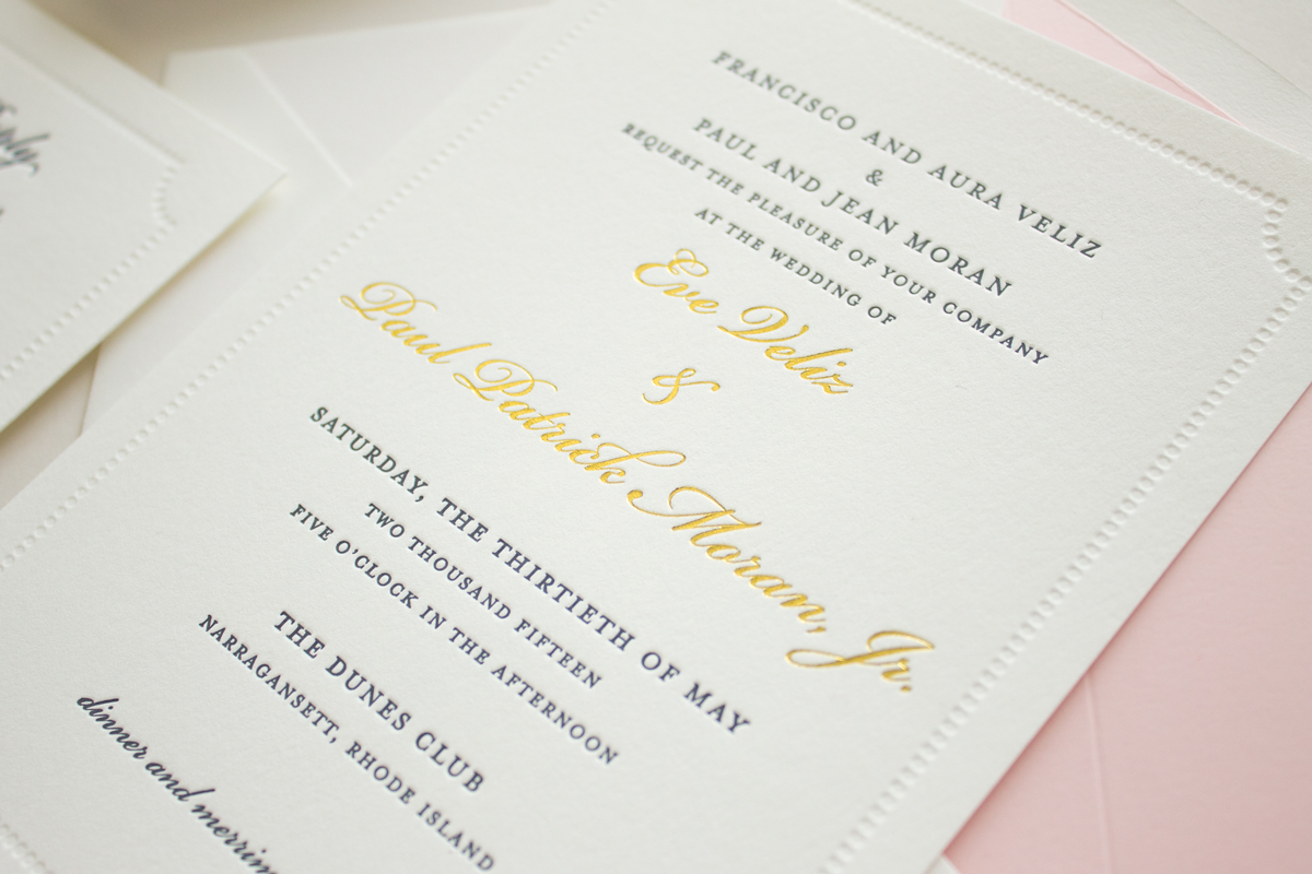
The dotted border in the custom invitation below is pressed into the paper using letterpress printing with no ink. The navy text is letterpress printing with navy ink, and finally the names are printed with gold foil stamping, making this design 2-Color Letterpress + Foil Stamping.
blind impress dotted border

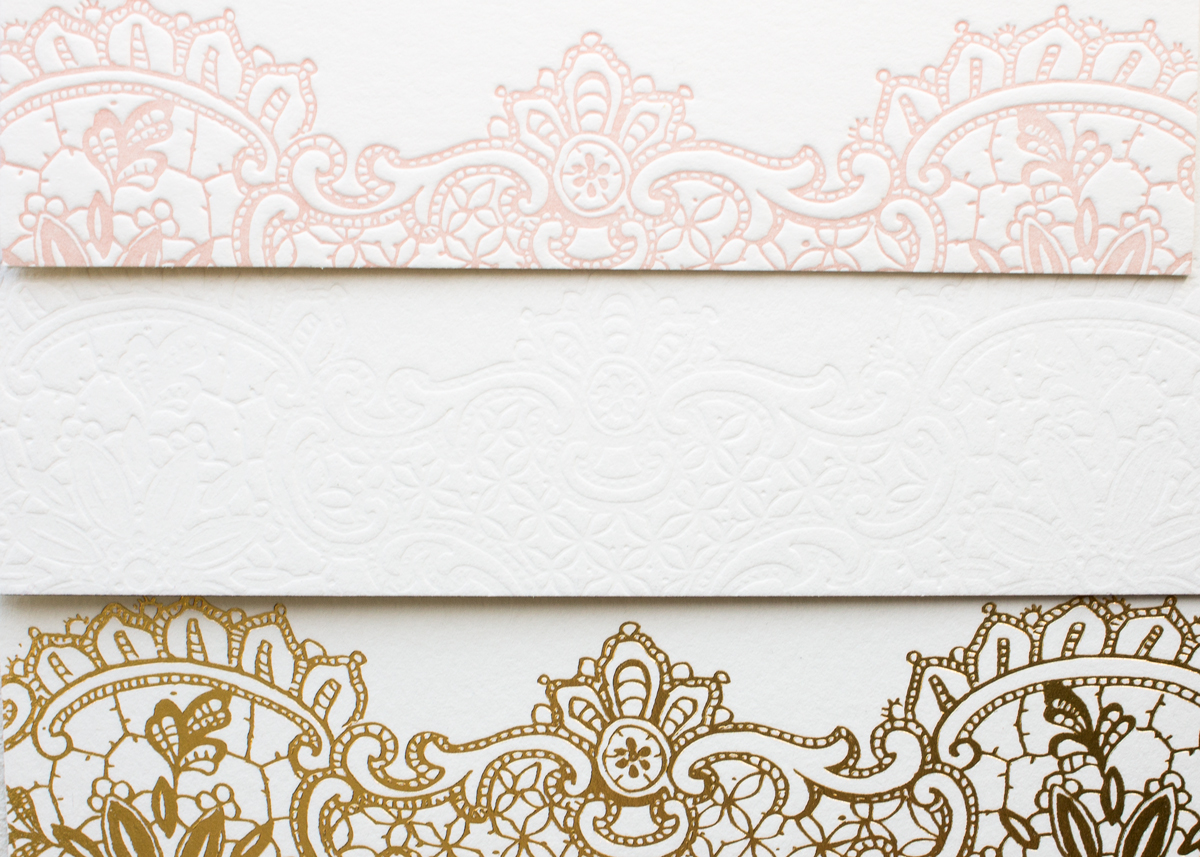
The image below shows the lace detail from the Hope invitation suite in pink letterpress (top), blind letterpress (middle), and gold foil (bottom). The design and production process is the same for the pink letterpress and blind letterpress – you just skip the ink when you “print” blind letterpress. It’s like what happens when you’re righting with a pen that has run out of ink. You can keep writing and you will see indentations in the paper where you’ve pressed the pen down, but there will be no color.

blind letterpress comparison

White Ink

White ink is another tricky “non-color” when it comes to printing. Brides often request white ink on a colored paper, and while it’s available it’s not as simple as it sounds.

There are a few different ways to print white ink, and each one has its benefits.

The first option is with flat printing. One option that gives the appearance of white ink is to print everything except the area you want to be white. In the example below, the white portion is actually the white paper showing where no ink was printed.
white ink save the date

White ink is also available with letterpress printing, however, the letterpress inks are not 100% opaque so the paper color will show through. For example, white letterpress ink on black paper will appear a bit gray.

A white foil is offered for foil stamping – this is the best choice when you want a completely opaque ink to prevent the paper showing through. White foil will have a little shine or gloss to it.

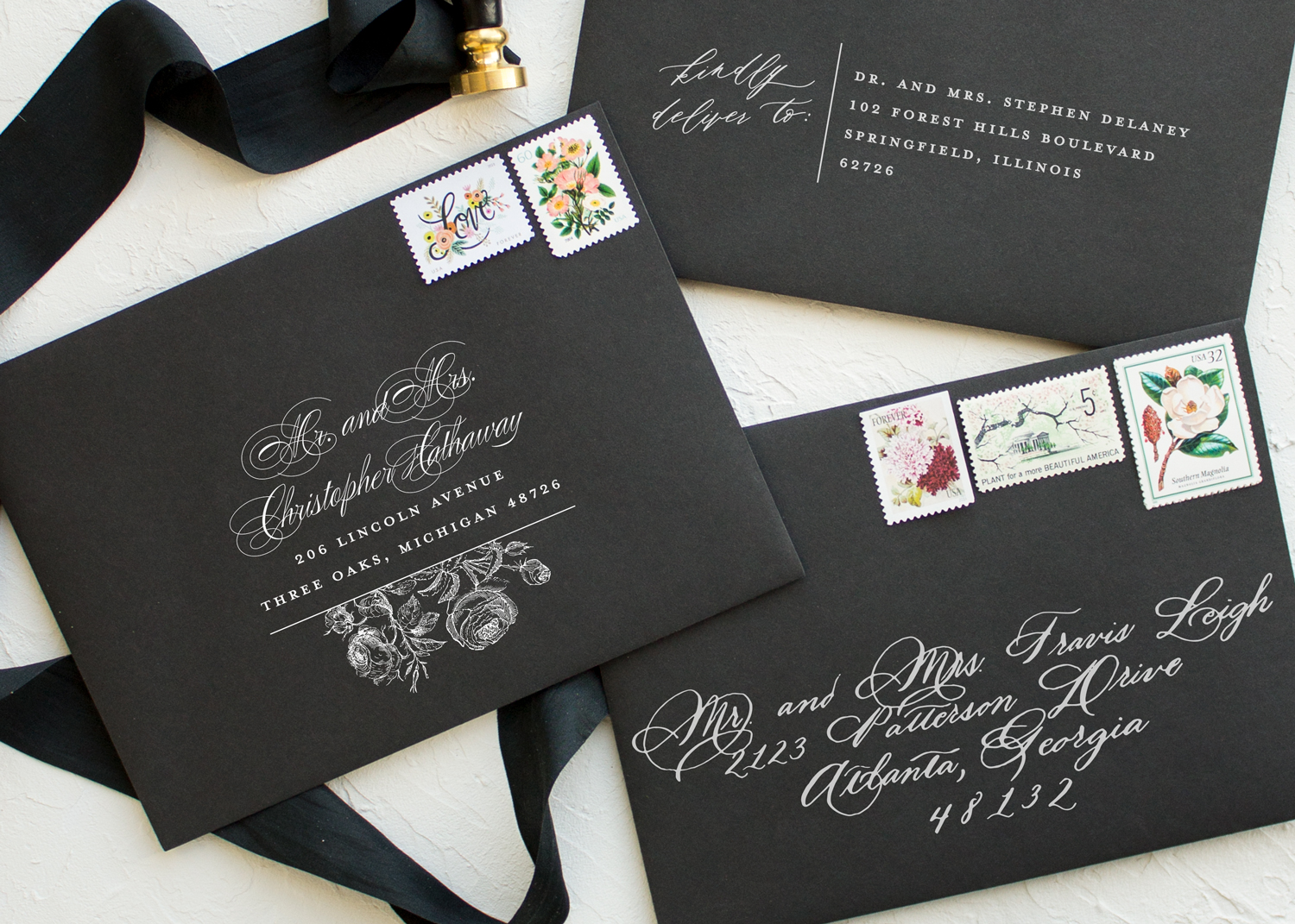
The next option for flat print white ink is a special white toner that can be printed on some colored papers. My favorite application? White ink address printing on black envelopes!
white ink printing on black envelopes

Screen printing is excellent for printing white ink on colored paper (as seen in the Beloved invitation below).
white ink screen printing

With so many variables to consider, how can you choose your colors confidently? Order a sample pack to see them in person! Still can’t decide? I’m happy to offer advice on your color choices!

In the next installment of The Wedding Stationery Guide, I’ll be sharing tips and things to consider when choosing the colors for your wedding invitation suite.

Previous Post: « How to Choose the Right Color for your Wedding Invitations | The Wedding Stationery Guide: Colors Part I
Next Post: Tips for Choosing Your Invitation Colors | The Wedding Stationery Guide: Colors Part II »

Primary Sidebar

MEET SARAH

Hello! I´m Sarah - I am a mom, wife, and stationery designer living in southwest Michigan. I believe in God and good manners, love beautiful typography, adore traditions, and am infatuated with pretty paper.
Read More…

Categories

Let’s Connect

  • Email
  • Facebook
  • Instagram
  • Pinterest
  • Twitter

Shop now: Minted.com

Looking for something?

  • Home
  • About
  • Shop
  • Policies
  • Contact

Footer

ABOUT ME

I’m Sarah, and I create tailor-made wedding stationery for brides that need a simple, classic invitation design with just the right amount of personality.

Banter & Charm is a Michigan wedding invitation design studio based in St. Joseph. Not local? I serve brides throughout Michigan and northern Indiana, Notre Dame, Chicago, the Midwest, and across the US. Read More…

Make sure your invitations are

EMILY POST-APPROVED

Avoid common etiquette mistakes with this free guide.

CONTACT

Feel free to contact me anytime:

 hello@banterandcharm.com

 Schedule a phone consultation

BANTER & CHARM

205 Main Street #331
St. Joseph, Michigan 49085
–
by appointment only

banterandcharm

I'm a mom, wife, and stationery designer specializing in classic and elegant letterpress wedding invitations based in southwest Michigan

Sarah Guse Brown
Are you team gold or team silver? It's easy to agr Are you team gold or team silver? It's easy to agree that edge painting is gorgeous either way! These two custom invitation suites feature metallic edge painting, but you can also choose a bright hue (like hot pink or sapphire blue) to add a pop of color to your invitations!⁠
⁠
.⁠
.⁠
.⁠
.⁠
.⁠
#banterandcharm #letterpress #letterpressinvitations #weddinginvitations #customstationery #stationerydesigner #formalwedding #weddingdetails #designisinthedetails #edgepainting #fineartwedding  #weddinginspo #invitationideas #marthastewartweddings #michiganwedding #chicagobride⁠
I can't think of a more fitting invitation for a y I can't think of a more fitting invitation for a yacht club wedding in Rhode Island! From the crisp white and navy color scheme to the classic border, every detail of Alejandra's invitation suite was perfection!⁠
.⁠
.⁠
.⁠
.⁠
.⁠
#dailydoseofpaper #fineartwedding  #customweddinginvitations #iloveweddingdetails  #invitationdetails #wedinginvites #letterpressweddinginvitations #romanticweddinginvitations #yachtclubwedding #newyorkweddings #customweddingstationery
Nothing says traditional wedding like this elegant Nothing says traditional wedding like this elegant invitation suite in soft gray letterpress on extra-thick cotton paper. There's a reason the classics never go out of style! ⁠
⁠
.⁠
.⁠
.⁠
.⁠
.⁠
#banterandcharm #traditionalwedding #classicweddings #letterpress #iloveletterpress #michiganweddinginvitationdesigner #weddinginvitations #invitationdetails #letterpressinvitations #monogrameverything⁠
Wax seals are on trend for wedding invitations rig Wax seals are on trend for wedding invitations right now! The wonderful thing about these seals is how versatile they can be. Wax seals aren't just for envelopes anymore, and I'm sharing 5 unique ways to use wax seals in your wedding stationery on the blog today! (link in profile)⠀⁠
⠀⁠
.⠀⁠
.⠀⁠
.⠀⁠
.⠀⁠
.⠀⁠
#theweddingstationeryguide #weddingplanning #weddingtips #invitationideas #fineartweddings #invitationdetails #weddingstationery #weddinginspo #stationerydesigner #waxseal
Tying a few pretty bows 🎀⁠ .⁠ I love postin Tying a few pretty bows 🎀⁠
.⁠
I love posting time-lapse videos - let's be honest, they're more fun to watch! - but they're deceptive. Even though you know the video is sped up, it's hard to tell how much. So I wanted to share one in real time in case you were thinking about assembling your own invitations.⁠
It took me about 1 minute to stack the pieces, wrap the ribbon, and tie 1 bow. I was going a little slower than normal to make it easier to see what was going on, but it still takes time! And if you've never done it before, it will probably take longer.⁠
So if you're tackling any part of your invitation assembly, make sure to give yourself plenty of time! (At least double the amount you think you need is a safe estimate)⁠
⁠
.⁠
.⁠
.⁠
.⁠
.⁠
#banterandcharm #behindthescenes #fineartwedding #assemblyday #basilicabride #venueND #NotreDameBasilica #notredameweddings #custominvitations #weddinginvitations #letterpress
Madison said "very very thick paper is a must" for Madison said "very very thick paper is a must" for her wedding stationery, so very very thick is what we did! The invitation was printed on 4-ply museum board, and when you have a piece of paper with edges like that you have to add a little gold edge painting.⁠
⁠
.⁠
.⁠
.⁠
.⁠
.⁠
#customweddinginvitations #thickpaper #edgepainting #dailydoesofpaper #floridawedding #keylargoweddings #oceanreefclub #goldfoil #fineartweddings #banterandcharm #customstationery #ilovepaper #weddingdetails #blacktiepreferred
The prettiest dusty blue invitations for Maura and The prettiest dusty blue invitations for Maura and Zach's wedding at @EtreFarms 😍⁠
Featuring letterpress on crisp white cotton paper with hand deckled edges. A coordinating "wedding weekend events" card featured sweet illustrations to highlight the different celebrations taking place that weekend, like a welcome party and morning after brunch.⁠
.⁠
.⁠
.⁠
.⁠
.⁠
#customweddinginvitations #michiganweddings #lovemibride #etrefarms #fineartwedding #deckleedge #letterpressweddinginvitations #letterpress #customstationery #banterandcharm
It's common to want to cross "stationery" off your It's common to want to cross "stationery" off your wedding to-do list once the invitations are finished, but there is so much more to your wedding paper! Think about all the items you'll need on the big day: table number, escort cards, menus, signs, programs . . .  Let's give them the same attention as your invitation suite so your stationery is flawless from start to finish.⁠
The best time to get started on day of stationery like this? I like to begin about the time you mail your invitations. This lets us finish up the design just in time for your RSVPs to start rolling in, and then you're not rushing around at the last minute to finalize everything!⁠
⁠
.⁠
.⁠
.⁠
.⁠
.⁠
#banterandcharm #midwestwedding  #chicagobride #southwestmichiganweddings #stationerydesigner #weddinginvitation #basilicabride #weddingstationery #customweddinginvitations #ceremonyprogram #ndBasilica #notredameweddings
Load More... Follow on Instagram

Copyright © 2023 · BANTER & CHARM · all rights reserved