Wedding Stationery Guide: Fonts, Part III
In this third installment of the Fonts portion of the wedding stationery guide, I’m going to share some tips for choosing the fonts for your wedding invitation.
When I designed the wedding invitation collection for Banter & Charm, I spent a great deal of time finding the perfect font to match the style of
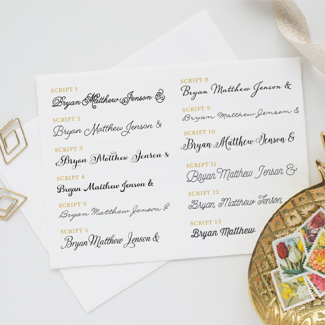
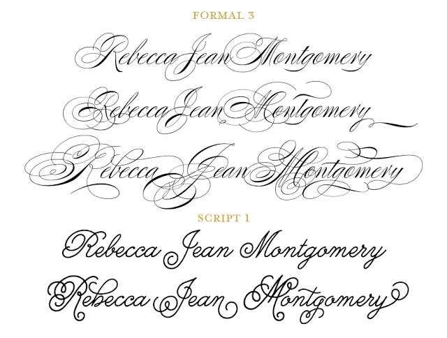
each designs. However, there are plenty of other fonts to choose from if you’re looking for something a little different. Maybe you’d like a more casual look, or you don’t care for the way your name looks in a particular script. No matter the reasoning, you can customize the fonts shown in any wedding stationery designs.
Please keep in mind that fonts are an integral part of every design. While I will work to make your desired font look great, not all fonts or font combinations will be a good fit for your design. If you’re unsure about a choice or combination, feel free to ask for advice. I’m also happy to provide a proof of a few different font options so you can see how it looks before making a final decision.
You don’t have to be a type nerd to notice that some fonts pair well together while others don’t.
Here are some tips to keep in mind when selecting fonts for your wedding invitations.
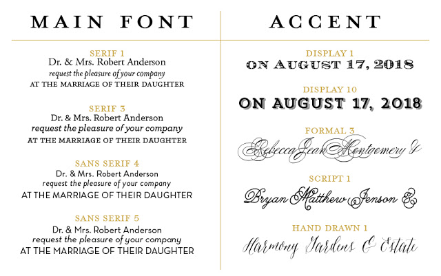
Choose one simple and easy to read font for the main text, and then choose a more decorative accent font for text you want to highlight (like the bride and groom’s names, venues, or headings on insert cards). Generally, this means you’ll pick one font from the serif or sans serif category, and one from the script, hand drawn, or display categories.
Hopefully these tips will help you choose the perfect fonts for your wedding invitation suite!


